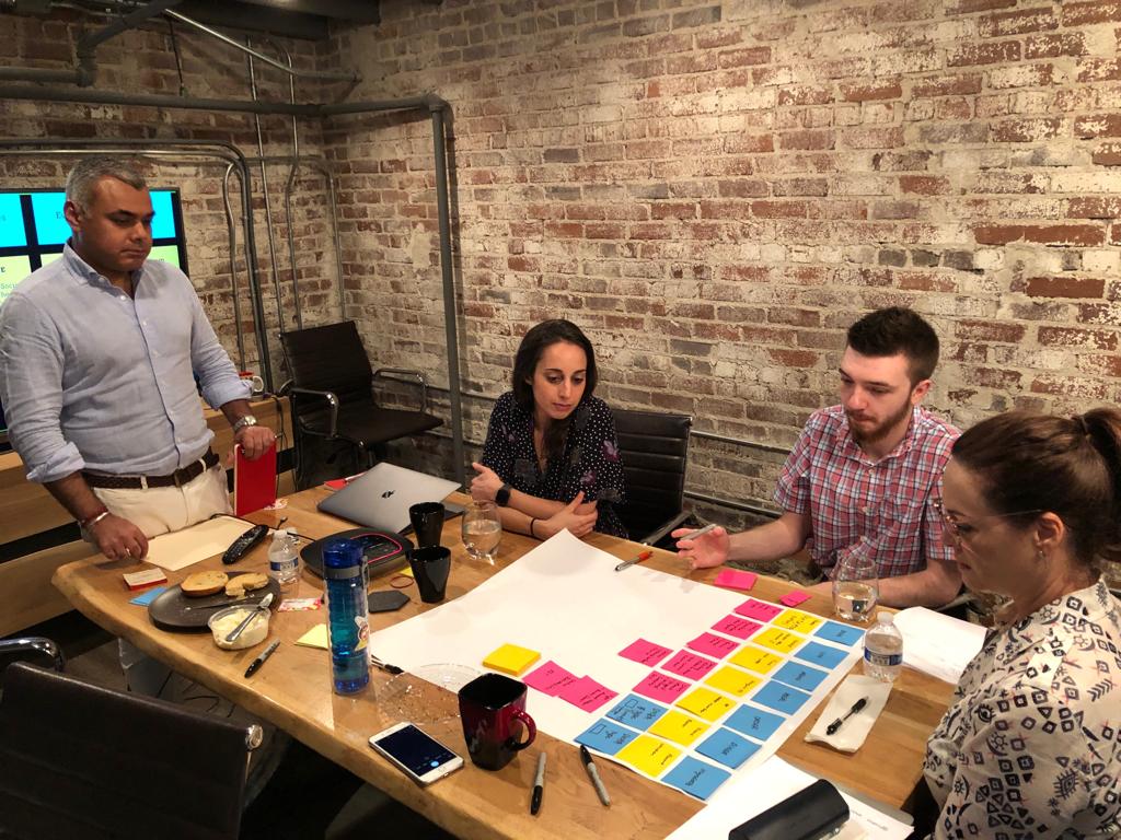
There are many factors that can cause a project to veer off track, but by far one of the biggest is unaligned stakeholders. Even internal projects typically involve several different departments, and possibly vendors or customers. Without clear communication and defined strategy sessions, one can assume that alignment exists when that may be far from the case.
After attending a Design Thinking session at the WP Engine Conference, we started thinking about some of the ideas presented, as well as the existing processes we use to ensure we have a shared vision with our clients. We do this upfront during our design phase because the earlier this happens, the better.
Here are a few exercises that may help with your own projects:
- Stakeholder mapping
- It always helps to begin your project by thinking about the people (stakeholders) involved. For an application or website, this may be who will be using the product or who will contribute to it, such as customers, employees, a 3rd party organization, your sales team, etc. This exercise involves mapping out all of these stakeholders and indicating how they relate to each other and the application. Having a representative from each of these stakeholder groups physically present will give them the opportunity to express their own needs.Doing this allows you to prioritize your users and decision-makers. It also allows you to define the persona and tone of the platform, as well as prioritize functionality and what is essential for an MVP (minimum viable product).
- Rose, Bud, and Thorn
- Use this technique to get more specific details from your stakeholders about what they like (or don’t like). For example, many people want a “clean website”, but what does that mean exactly? ‘Clean’ can be expressed in many ways; color choice, spacing, font-weight, white space… How can you narrow it down? We love the “Rose, bud, and thorn” method from Tina Schweiger and Alisa Weldon at Good Idea Company.Do a bit of competitive research on what other companies are doing with their website or applications that are similar to yours. Print physical copies of the screens and stick them on the walls of your workspace. Using different colored post-it notes, pinpoint those things about each that you like (rose), those that have potential (bud), or elements that you dislike (thorn). This quickly highlights where stakeholders are in agreement and leads to a productive discussion where there are differing opinions.
- Object-Oriented User Experience
- This exercise involves identifying the core objects that anchor your website or application, defining the content associated with objects, mapping out the relationships, and assigning visual hierarchy. (Read more about the process and its benefits here.) We perform these interactive exercises as the first step of our design process, which pulls the details to the forefront and greatly streamlines the design and development phases that follow. Once the core elements are identified, this can easily be translated into an elegant, intuitive platform that is easy for users to adopt.Implementing this process has allowed us to align our clients, our designers and our development team with a common understanding very early in the project, thereby reducing questions and delays further down the road during the more costly stage of development.
Try some of these exercises on your own projects and let us know how they go!
