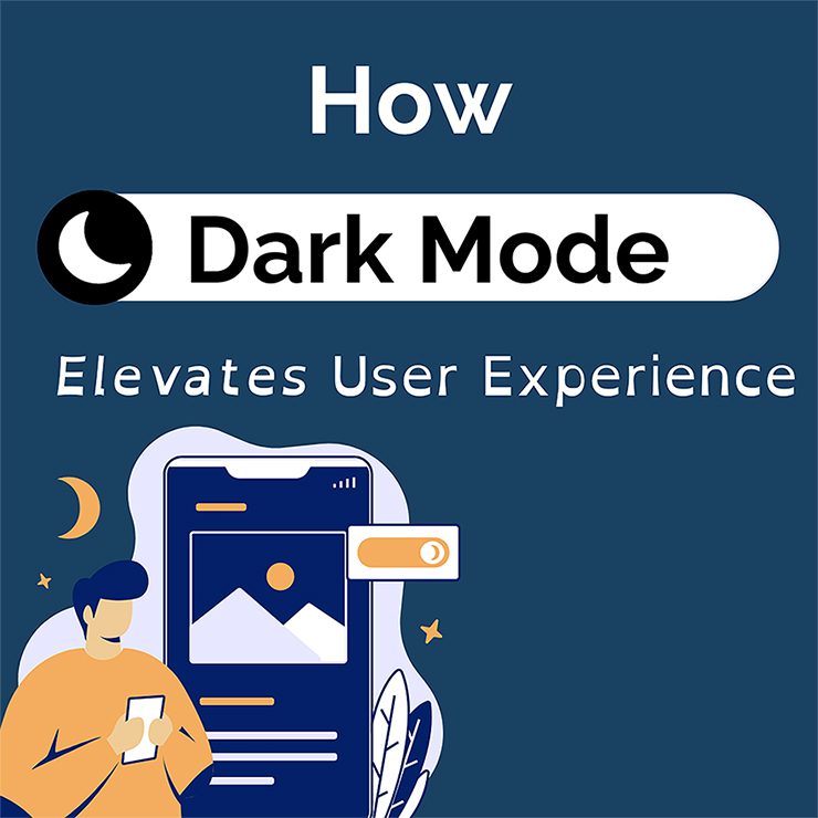
Dark mode has become a staple feature across digital platforms, transforming how we interact with apps and websites. It’s not just a sleek alternative to the bright white backgrounds we’re used to; dark mode offers numerous benefits, from reducing eye strain to conserving battery life. In this blog post, we’ll explore 5 ways that dark mode impacts user experience (UX) and why it’s become an essential tool for UX designers.
-
Reducing Eye Strain
One of dark mode’s primary benefits is its ability to reduce eye strain, especially in low-light environments. By decreasing the contrast between the screen and its surroundings, dark mode creates a more visually comfortable experience. This particularly benefits users who engage with tools and applications for extended periods, making their digital interactions less taxing on their eyes.
-
Conserving Device Battery Life
Dark mode also offers a more tangible advantage in its ability to preserve devices’ battery power. For devices with OLED or AMOLED screens, displaying darker pixels uses less energy, which improves battery life. UX designers can enhance the efficiency and sustainability of applications, making them more appealing to energy-mindful users.
-
Accessibility and Inclusivity
Dark mode enhances accessibility by enabling more users to use an application. Users with visual impairments or sensitivity to light find dark mode more comfortable, allowing some to use those applications for longer. By incorporating dark mode into an inclusive design strategy, UX designers can ensure their applications are accessible to a broader audience.
-
Branding and Aesthetics
From a design perspective, dark mode offers a unique opportunity to create a distinct visual identity for an application. UX designers can experiment with color contrasts, highlight key elements, and emphasize certain features to enhance aesthetic appeal. Thoughtfully implemented dark mode can reinforce brand identity and boost user engagement, making the digital experience more memorable.
-
User Preferences and Customization
Dark mode helps designers support the diversity in user preferences by empowering users to choose their preferred mode. UX designers should prioritize user choice, allowing individuals to switch between light and dark modes based on their preferences and environmental conditions. This customization leads to a more personalized and user-centric experience, showing users that their comfort and preferences matter.
Striking the Right Balance
While dark mode offers several benefits, its implementation requires careful consideration. UX designers must balance aesthetic choices with readability, ensuring text and key UI elements remain clear and legible. Attention should be given to color contrast, avoiding combinations that could cause strain or reduce readability. Designers should also be mindful of the increased cost when designing two different interfaces.
Conclusion
The impact of dark mode on user experience goes far beyond its visual appeal and has become a powerful tool in the UX designer’s arsenal. As designers navigate an ever-changing field of technology and user preferences, thoughtful implementation of dark mode can significantly contribute to an immersive and user-friendly experience.
