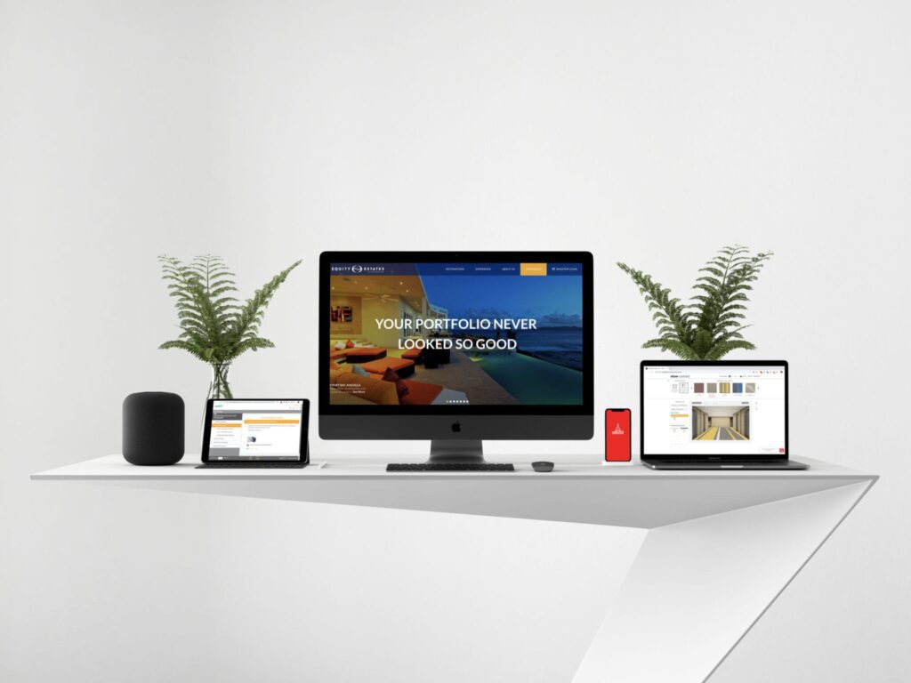
75% of consumers make a judgment on a company’s credibility based on the design and usability of their website, and 88% of buying decisions are made before talking to anyone. Websites can easily look or feel outdated in this constantly changing industry so keeping your website updated becomes a crucial business process.
So what does up-to-date look like in 2019? We’ve reflected on the design trends that have and will continue to be popular this year. Here are four major trends we’ve noticed, along with some real-world examples. Think about how your own site takes advantage of these trends, or what you could improve.
1. Curated visuals & graphics
The internet is full of vibrant, color-blocked websites using stock images. You can stand out by being intentional with carefully selected visuals and graphics that best represent your company. Finding a designer who will curate unique graphics for your site takes it to the next level and helps validate your credibility. Specific examples of how to do this include:
Authentic tones and textures
Avoiding stock photography and blocks of color creates a connection with users. Use natural tones and add textures that speak to your industry.


(Examples: Paper Boat, The VIQ)
Layers
Adding layers to your site provides depth and adds a more tactile feel. Elements on a page can be layered, but we’ve also seen more layered graphics that look like papercut illustrations.


(Examples: History of Hockey, La pierre qui tourne)
Data Visualization
As with graphics, invest in custom data visualization. They’re a much more interesting and understandable way of presenting complex information to users. Showcasing your data with on-brand visuals is not only a more enjoyable experience, but will also help with comprehension.

(Examples: FedEx)
Customized Graphics & Icons
Keep your branding consistent and opt to customize your own iconography and graphics. This makes your website cohesive and establishes credibility among users.


(Examples: Daily Harvest, gilk)
2. Movement
Static websites can be developed by anyone and feel stiff. Adding small animations when users interact with elements of your site sets the tone for a more immersive experience.
Micro-interactions & Animation
These are small animations associated with interactions (button click, scrolling, hover) that are more tactical. Think about how these elements would operate if they were real world objects.


(Examples: Polugar, Monograno Felicetti)
Dynamic Scrolling
This transforms a 2D web-page into an immersive experience. Elements can interact and move with each other, and can be showcased in a multitude of ways.


(Examples: is.graphics , Dominic)
Purposeful Animation
Animations add interaction to your site, but can also be an important indicator of work happening behind the scenes. However beware: animation without function can be frustrating. Make sure that it serves a purpose to your user.


(Examples: Fire Protection Services, PP Performance)
3. Dimension
Though there is always a time and place for clean, grid based designs, a combination of flat design and 3D objects provide a much more visually intriguing site. Adding dimension to design elements make them seem like real objects, and feels more natural.
3D Design
Three-dimensional design is everywhere these days; designs with so much depth you want to reach out and grab it. We’ve also seen an increase in 3D designs with futuristic and quirky looks!


Gradients & depth
Though this is really a combination of 3D design and authentic tones, gradients can add dimension to the point where the design looks like its jumping off the page. Additionally, for sites that may have little imagery or graphics, gradients can add dimension with a minimal, clean look.


(Examples: Caroselling)
Minimalistic asymmetrical layouts
Block grids are a thing of the past, and asymmetry is in! No one likes visiting sites that look exactly like the last five. Switch it up and vary the layout of your site. This can also help guide the eye and lead your user down your page.

(Examples: Bento)
4. AI/Technologies
Though this is still making its way to the world of websites, we felt it was important to highlight how businesses are adapting to changing technologies. Implementing these technologies on your site or within applications can improve the customer journey and your overall success.
AI, deep learning and machine learning
Technologies such as voice control and voice-activated assistants like Alexa are becoming more and more popular among consumers, eliminating the need to spend time on simple or tedious tasks. Other AI tools exist with platforms or applications (smart replies in Gmail, matching candidates to employers in LinkedIn), but we see the benefit spreading to websites as well. Think about how beneficial it would be to filter and generate unique content to website visitors through no effort on their part!
Chatbots
With the emerging culture of immediate gratification, timely customer service has become even more critical. Those chat bubbles that pop up on your screen are a quick and easy way to reduce the strain on customer support and handle small issues effectively, without much oversight. They can also be used to automatically funnel users down the appropriate path, for sales, troubleshooting and more!
While this is not an exhaustive list of trends you’ll see in 2019, we hope we’ve inspired you to take advantage of design and technology advancements to update your own website
